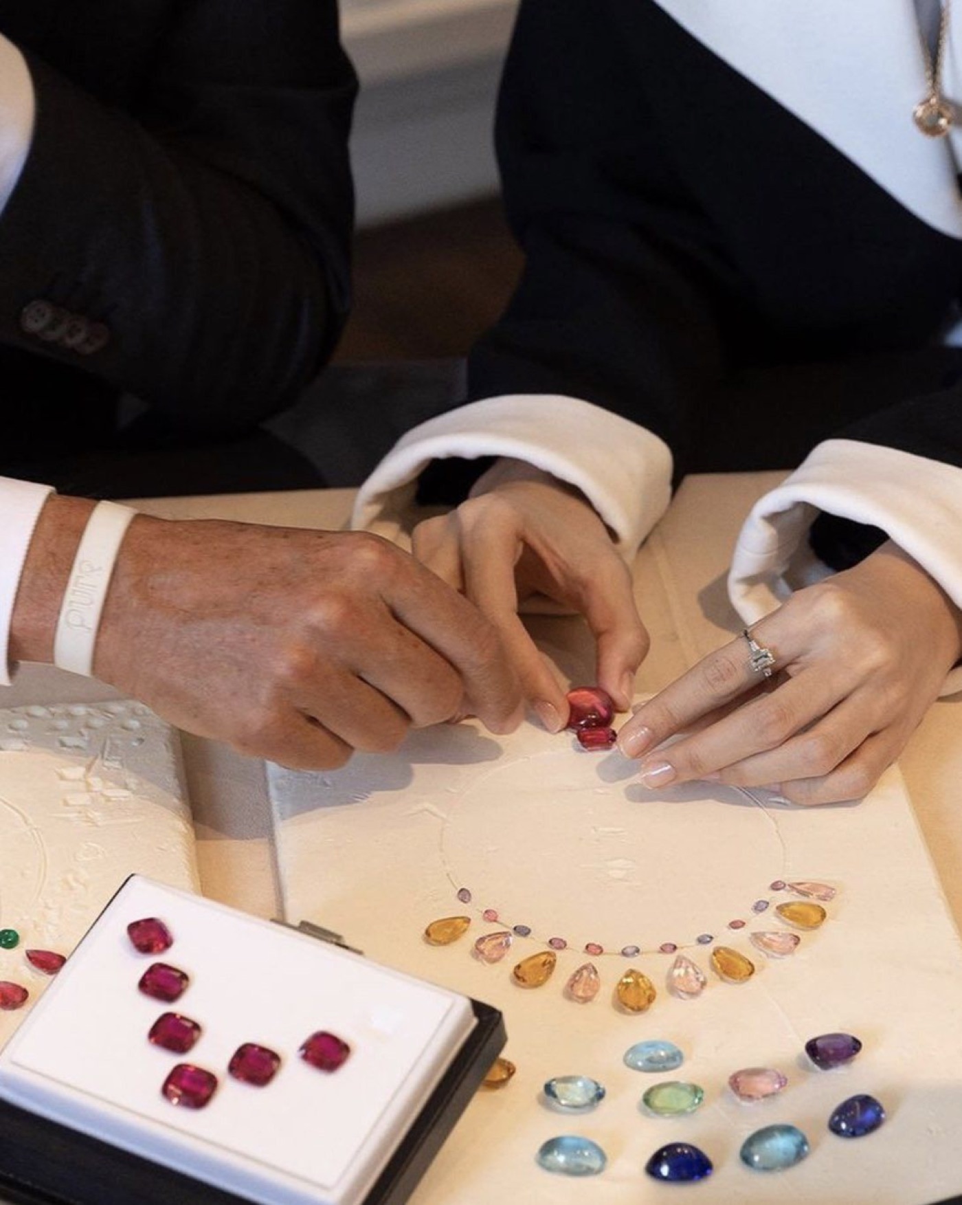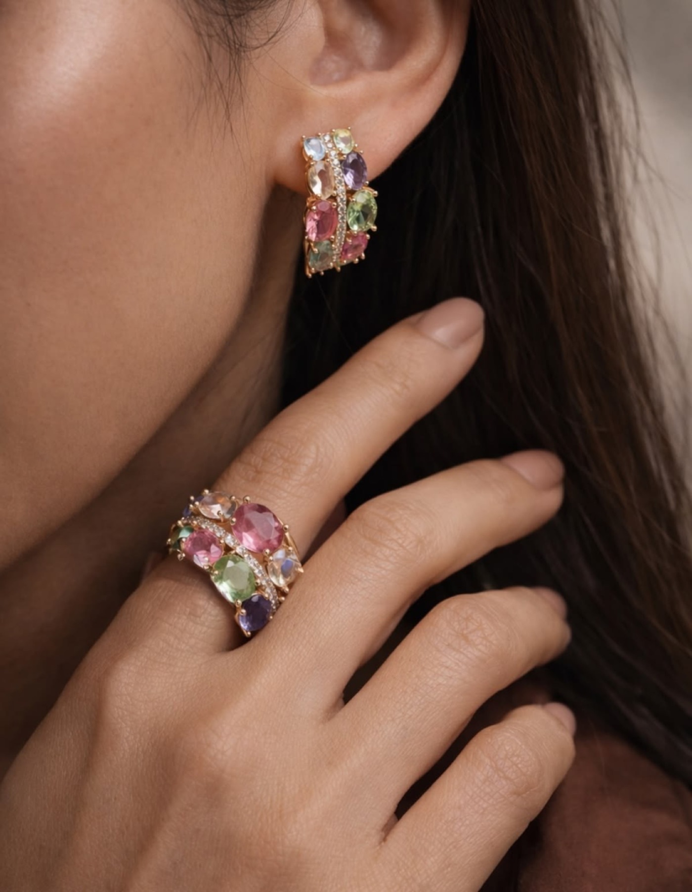
A jewelry brand built around a feeling, not an occasion.
A complete luxury brand identity for a colourful zircon jewelry brand. From concept to packaging system, we built a world around one feeling — the light landing on you at just the right moment — and the clarity that follows.
Positioning the brand before designing it.
Most fine jewelry asks you to wait for a reason — an anniversary, a promotion, someone deciding you've earned it. Opulesse doesn't wait. It's built for the ordinary moment when the light catches a stone and you remember, for a second, who you are.
Someone who already treats herself well.
In small ways — the good coffee, the candle she actually likes. Opulesse fits that same instinct. Not a special occasion. Just a day that deserves something beautiful too.
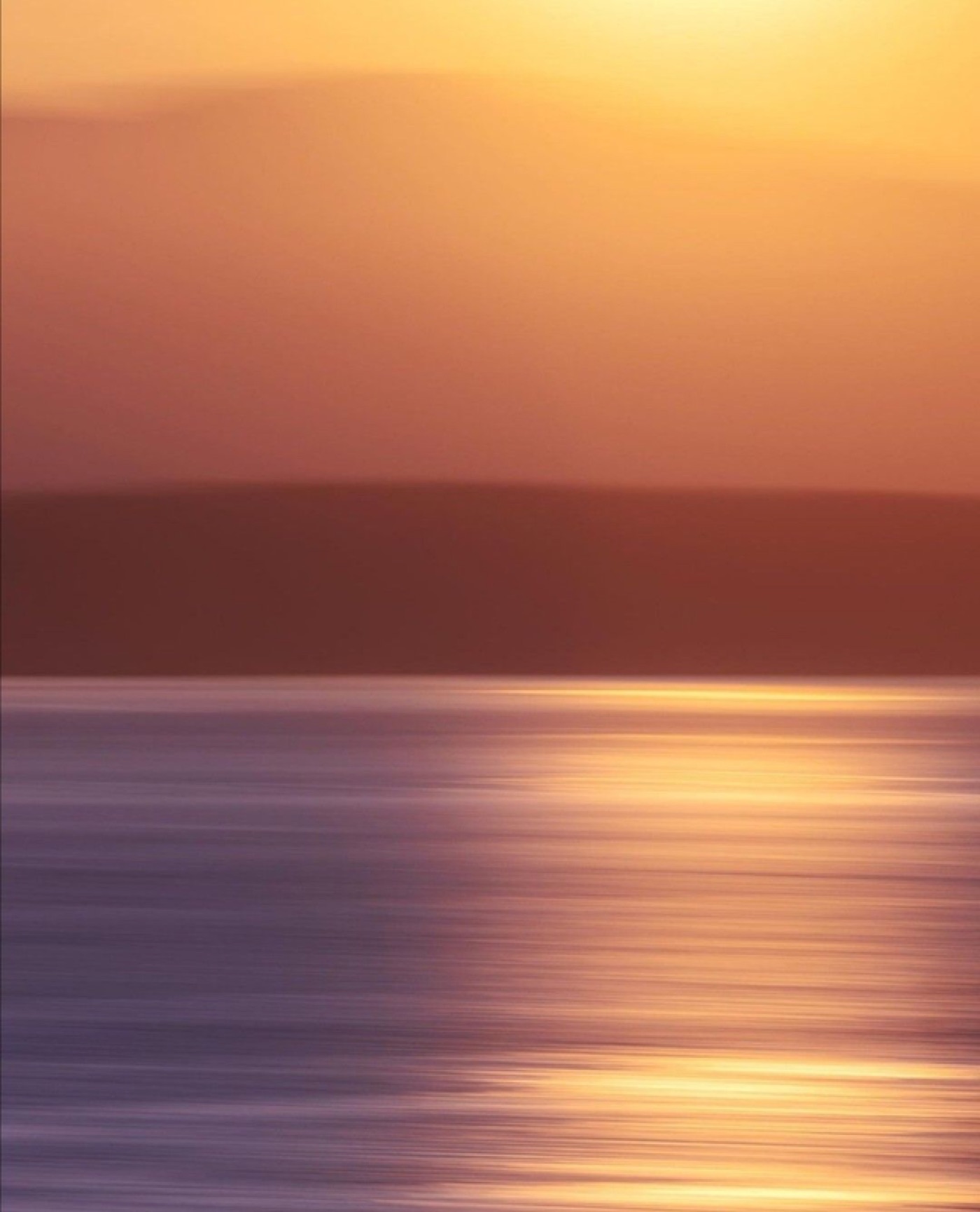
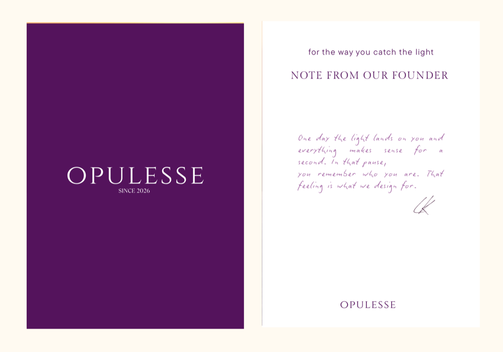
“One day the light lands on you and everything makes sense for a second. In that pause, you remember who you are. That feeling is what we design for.”
— LK, Opulesse
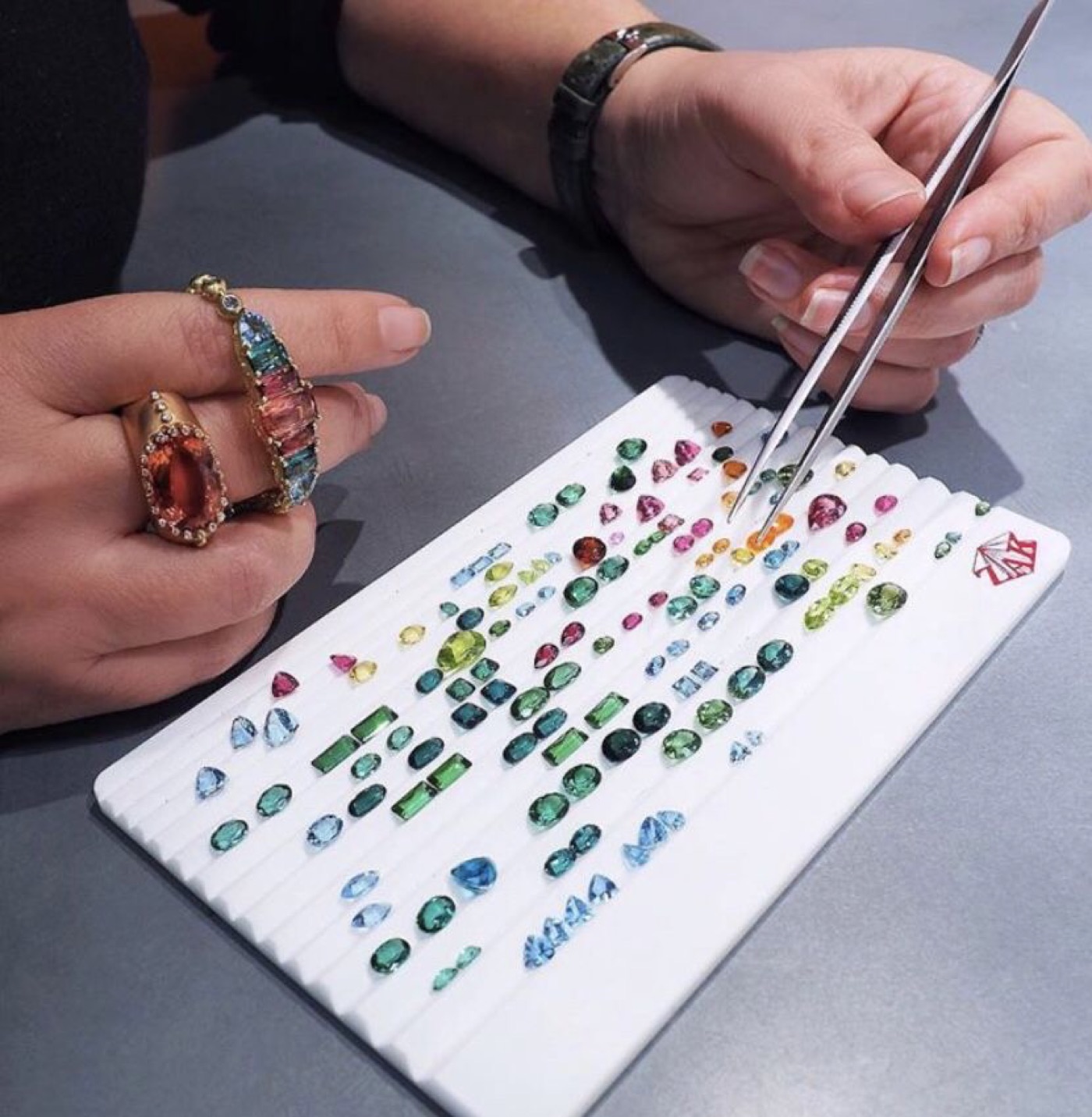
Every piece is built around unexpected colour combinations, not another clear stone trying to look expensive.
Pieces meant to be stacked and worn often, not kept in a box for one event a year.
The tone stays warm and personal, not cold luxury detachment.
Where strategy becomes something you can see.
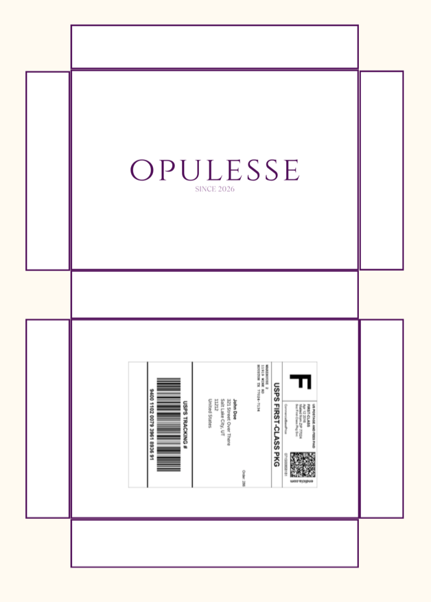
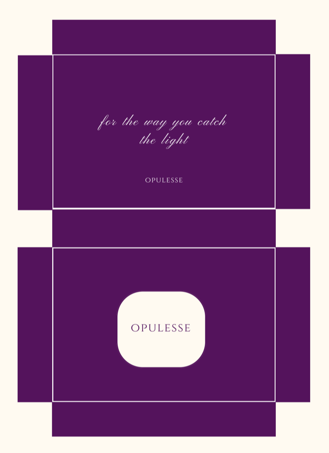
Set in Cinzel, a Roman-inscriptional capital, to keep the wordmark composed even against the brand's most saturated colours.
Open it the way a customer would.